
Overview:
KryoSleep is a fictional brand I created for a brand design project, the project included a branding book, business card, and letterhead. The objective of this project was to practise the ability of logo design, layout design, appropriateness, consistency, and presentation using Adobe Illustrator.
First Step:
My partner and I started off the project by picking a company. We came up with numerous ideas, but after talking with our TA, we settled on making a cryonics company. Its futuristic and technological aspect creates a lot of design possibilities for the project. After that, we started to work on different parts of the project, and I was in charge of the typography.
The Name:
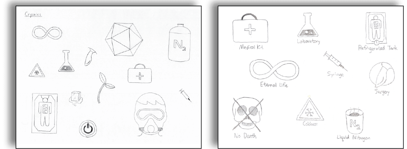
Coming up with an appropriate name was essential. Since the company is aimed to give people a chance to revive in the future, I wanted the company name to be somewhat comforting, so I named the company KryoSleep. After that, I needed to prototype the logotype. I used a method called brain-dumping. It involved drawing things related to the idea without overthinking. These sketches created the fundamental step for making our logotype.
The Fonts:
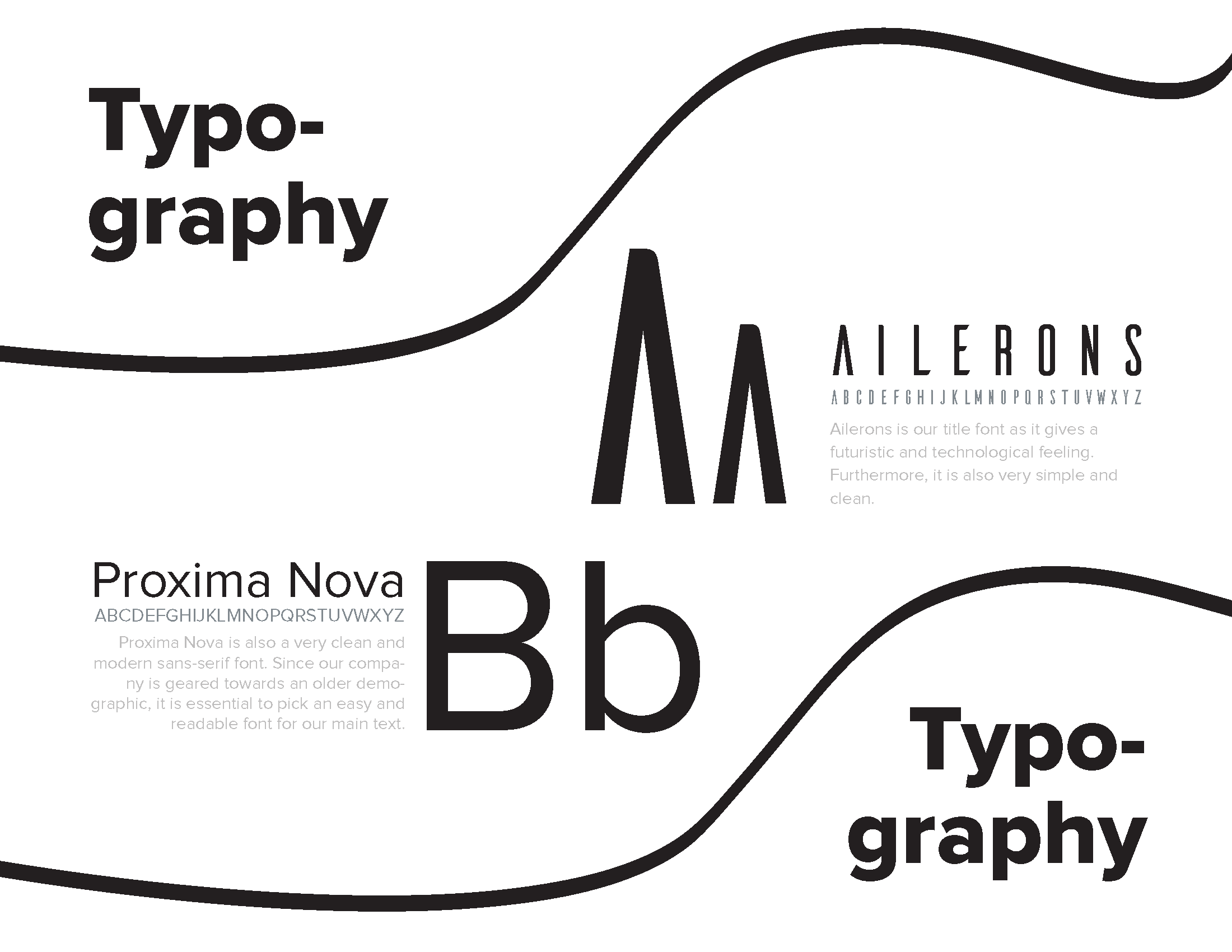
I then started looking for fonts. The font Aileron caught my attention. The font gives a futuristic and technological feeling, but it can be a bit difficult to read. Thus I used Proxima Nova, a clean and easy-to-read font, as our body text. The two fonts also created a nice contract pleasing to our eyes. At the same time, both of them are minimalistic sans-serif fonts that suit our theme. After that, I needed to create the logotype by combining the brand name and the logo.
The Logo:
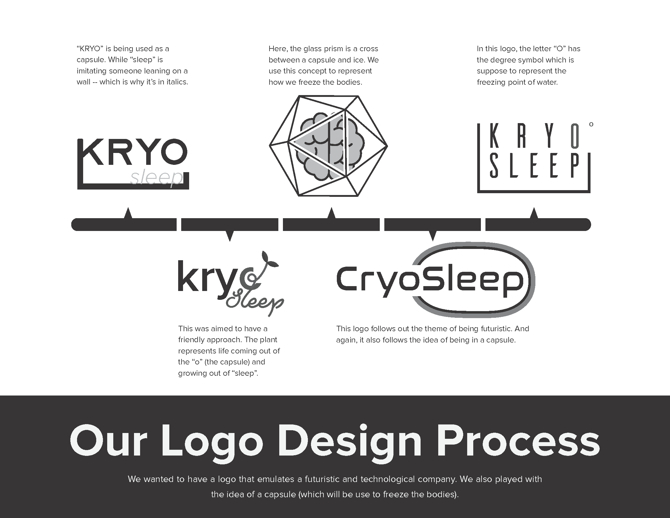
This was a difficult step as it required us to combine a vector graph and text and look natural. I came up with numerous prototypes for the logotype with my partner, including extending lines on the text, hexagon container, and growing leaves out of the text, but none of them stood out to me. Just as I got stuck on this step, my partner and I talked with our instructor during his office hour. He gave us the idea of making a simple shape using lines and wrapping the text in it. This was extremely helpful in pointing us in the right direction to the final logotype.
Final Logo:
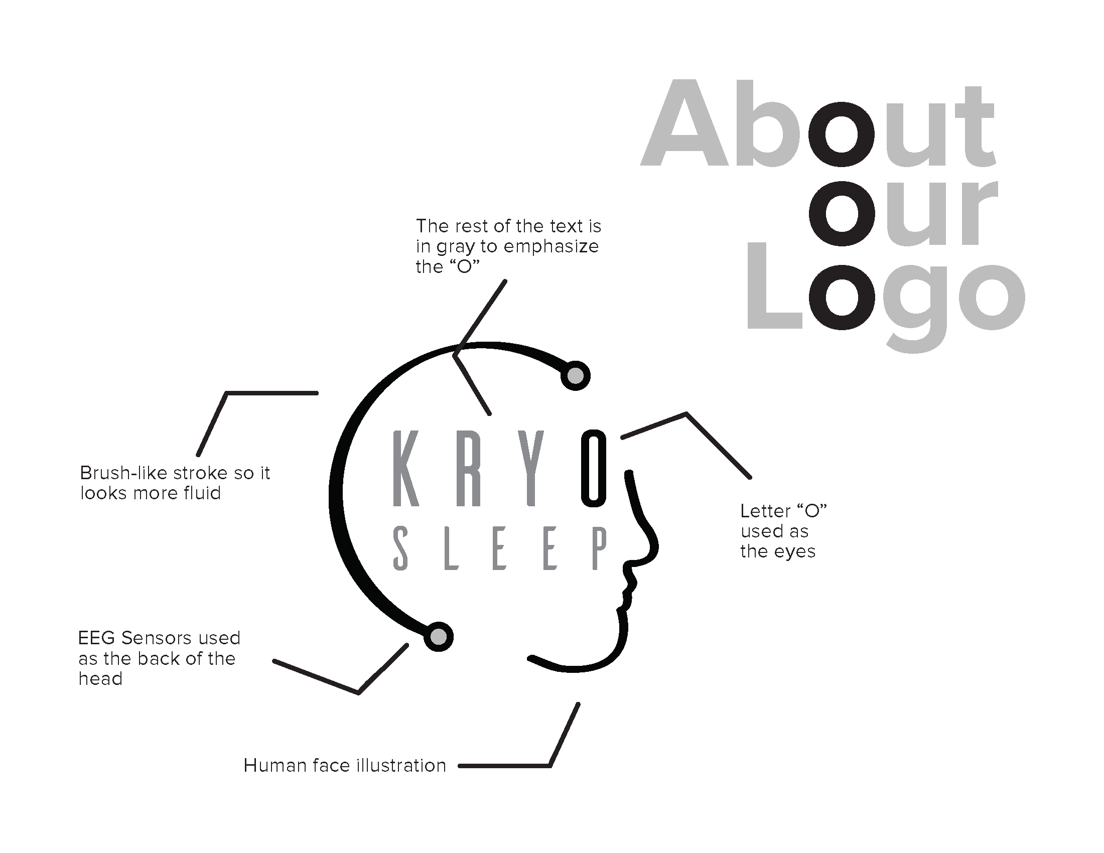
And finally, we created the final logotype. It has the company name “KryoSleep” in Ailerons font with the shape of a human head wrapping the text. I also increased the spacing of the letters for better readability and used the letter “O” to represent the eye. The circles in the logotype were added as a detail to increase the sense of technology for the company.
Conclusion:
This project fully achieved our expectations. It met all the objectives while staying consistent with the futuristic theme. From this project, I improved my composition and consistency skills, and most importantly, effective team-working skills. You can view the full branding book here.